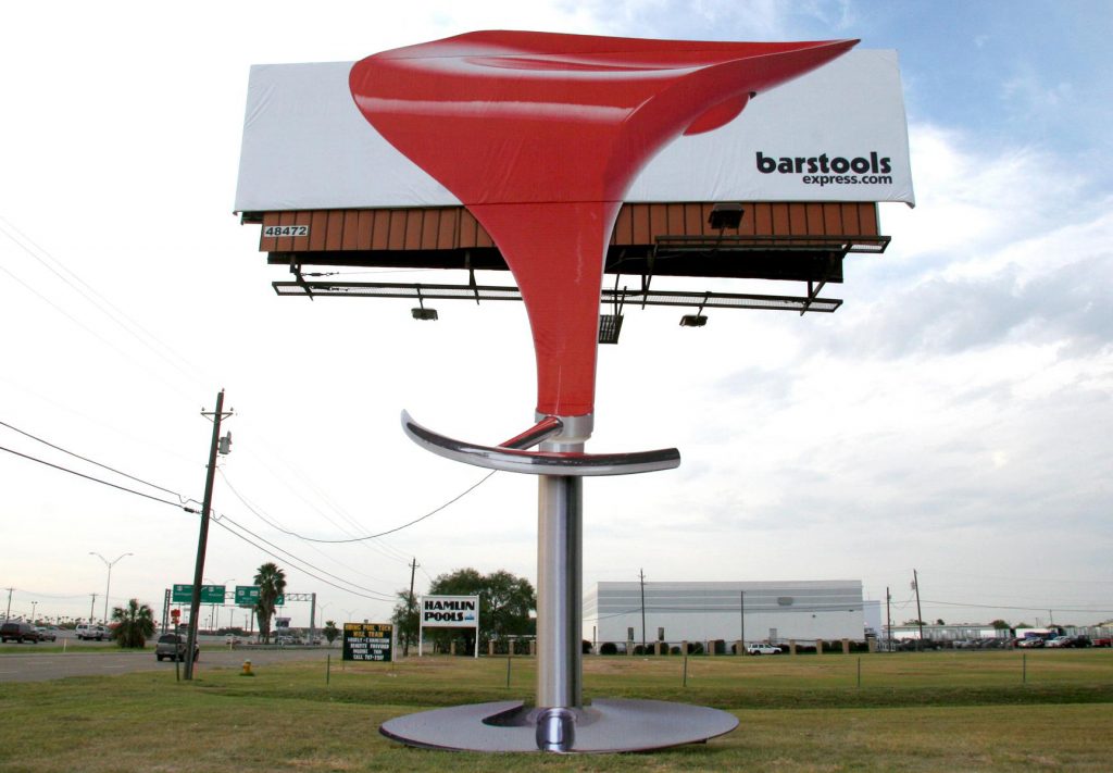
In OOH, we’re lucky. We have an audience BUILT IN, but as creatives, it’s still our job to get the attention of that audience. We still have to make them look. I believe we can achieve this by either being really simple OR making them really stand out.
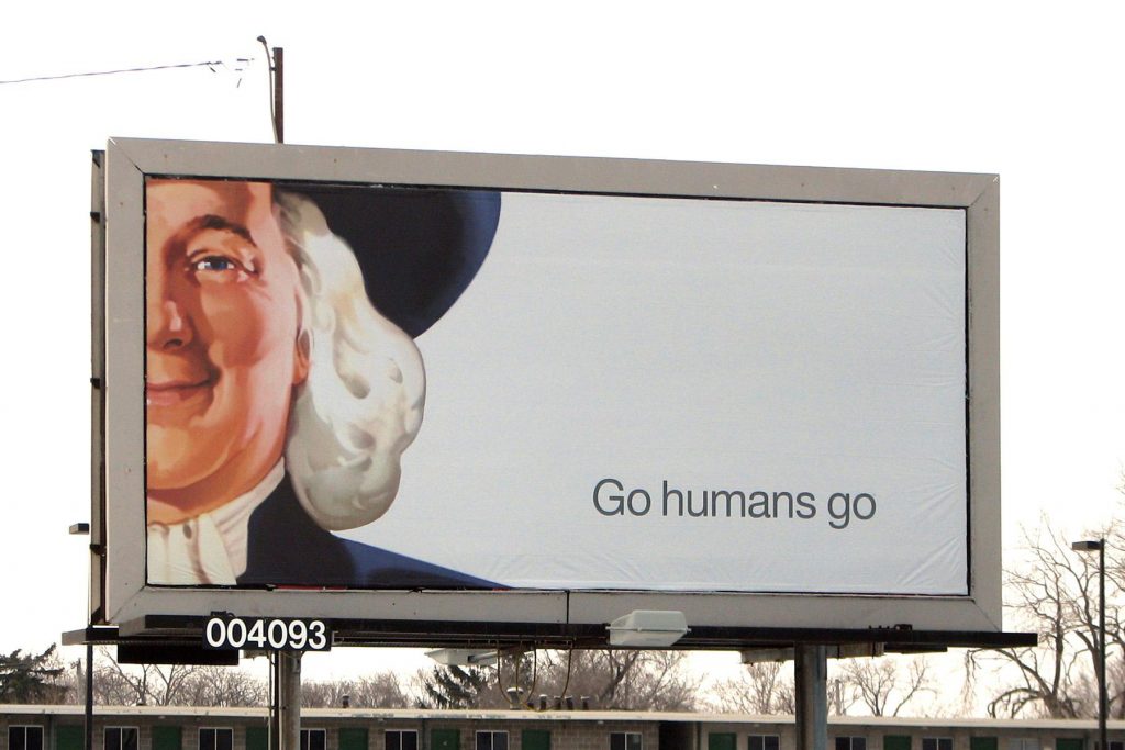
Simplicity
There is beauty in simplicity. I love negative space, and I wish I could see more of it. Times have changed from when I entered the OOH industry 19 years ago. For years, our challenge has always been to help client’s narrow creative elements and help them achieve their goals. Honestly, we should not have to do that anymore. In today’s world, anyone can locate a website, phone number or address in a few seconds. Because of this, our goal should be to make that consumer RECALL the name. Period.
The brands in the following examples get it. They chose to use the best visual medium out there coupled with simple images to evoke a feeling, memory, want, or need.
The beauty of negative space is that it forces your eye to read what IS there. In this Quaker ad, we all read the same three words. Negative space forces your eyes to read the ONLY thing there. That’s smart and effective OOH.